Ideas for a product:
My product decision:
Product: Water bottle with a variety of flavours installed.
Marginal or minority of target audience: This water bottle caters primarily to those who aren't fond of the natural taste of water, as well as individuals engaged in regular workouts or those with high water consumption.
Ideas for a name: Fruit Burst, Fruit Fusion, Citrus Splash, Exotic Splash. I made sure the names incorporated some type of fruit characteristic.
I have decided to pick 'Fruit Burst' because this product allows you to pick a fruit flavour of your choice and then it bursts into the bottle ready to drink. This product's advantage lies in its versatile bottle cap, enabling you to select from up to five flavours. However, a drawback is its limited portability due to the size of the 1-litre bottle.
Brands, logos & slogans:
Brand: A brand is like a distinctive personality for a product or company, made up of its name, logo, and design. It sets it apart and influences how people see and trust it. A good brand communicates a message and values, building customer connections.
Logo: A logo is like the face of a company or product, a visual symbol made up of shapes, colours, or text. It's a quick way for people to recognise and connect with a brand, playing a key role in making the band memorable.
Slogan: A slogan is a short catchy phrase designed for advertising or promotion. It aims to quickly communicate a message about a product, brand, or concept, leaving a memorable impression on people.
Nike's logo is the most successful due to its simplicity, versatility, and powerful symbolism of movement, energy, and speed aligning perfectly with Nike's brand identity.
Nike's logo is the most successful due to its simplicity, versatility, and powerful symbolism of movement, energy, and speed aligning perfectly with Nike's brand identity.
These two logos are an example of bad logos. The first one is too bright, making it almost illegible for people to read. It also needs to include more detail. The second logo has an unwanted background that must be more professional and basic.
Planning the product:
Product: A water bottle with a variety of flavours installed.
Name: Fruit Burst Water
Scetch/Plan:
These are sketches of what my logo could look like. I incorporated fruits into the design because my products had fruits in them. I could've added water to the logo to show that it is a drink.Final Piece:
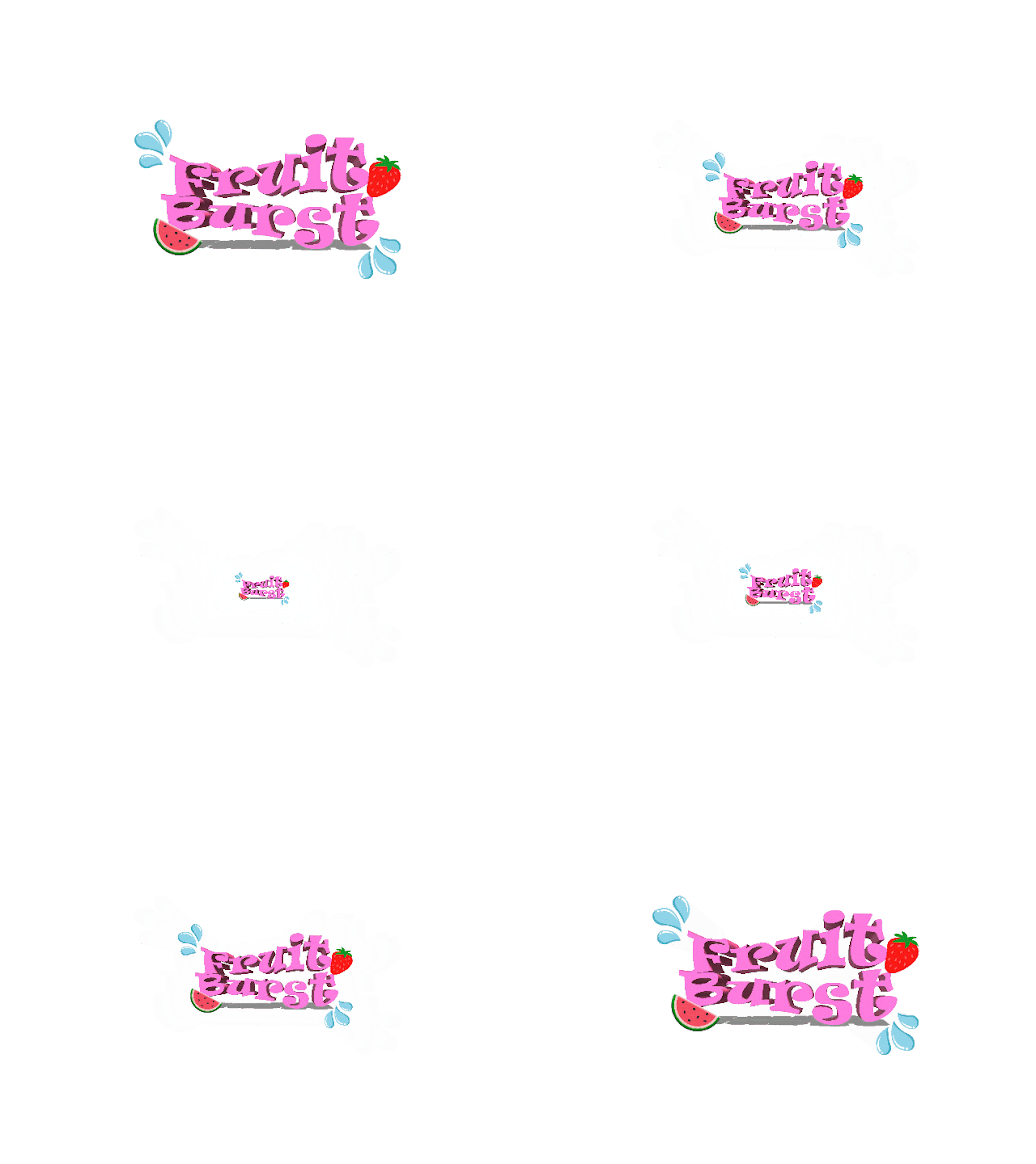
This is a logo for my product 'Fruit Burst'. To plan, I made a couple of sketches above before I made the logo for my product. What influenced me to create this log are cartoon colours and text and the bright colours that made the logo pop. To create this logo I used Photoshop and added text then made it into a 3D model. Moreover, I used images from Google to get images of different fruits and then placed them around the text. What went well with this logo is that the colours correspond with the idea of being bright, colourful, and legible. One thing I can change to improve the logo is to make the word 'Burst' a different colour.
Package Scetch:
In my package sketch, I ensured a clear presentation by incorporating the logo prominently, highlighting the key feature of the twisted cap for flavour customisation, and maintaining transparency in the design of the water bottle for simplicity and clarity.
Package:
To create this package I opened Illustrator then I selected a clean and crisp image of a transparent water bottle and imported that into Illustrator, perfectly suited for my product. I then seamlessly integrated my logo onto the bottle, achieving a convincingly realistic appearance. This would've been better if I curved the logo into the bottle and added a better quality bottle and customised it a bit more, it would've been my ideal product.
Animated Logos:
Source: https://bpando.org/2014/10/14/the-best-of-bpo-animated-logos/
The animated logo for the California College of the Arts (CCA) excels in minimalism, employing a clean design with a palette of simple colours such as white and black. This approach enhances legibility and contributes to an aesthetically pleasing animation.
This animation, created by Bedow for Erik Penser Bank, features a squiggly design transforming into the bank's logo through two smooth lines. While the animation is visually appealing, it could be improved by elements relevant to the brand. Adding subtle cues related to the bank's services, values, or industry would create a stronger connection between the animation and the brand identity.
This stunning animation by Fab Media, in collaboration with Bedow, Sweden, exemplifies minimalistic design and simplicity. What sets it apart is its strong relevance to the brand. It effectively captures the essence of the brand identity and effortlessly communicates its key messages. This animation truly showcases the brand's unique qualities and leaves a lasting impression on its viewers.
Animated Own Logo:
To create this animation, I used
Copyright and image file types for web
What does copyright mean?
Copyright is a legal protection granted to creators of various forms of art, including literature, drama, music, and artwork. It automatically grants these creators the authority to determine how their creative works can be used and restricts others from using or reproducing their work without permission.
The rights include the ability to show and perform the work publicly, make copies and changes to it, and distribute and rent it to others. The creator also has the right to be credited as the author and can object to any negative treatment or distortions of their work.
Creative Commons Symbols
Share Alike means that if you choose to share your work with others, you give permission for them to create new versions or adaptations of your work, but only on the condition that they use the same license as you did for your original creation.
Public Domain Work refers to creative works that are not protected by copyright law. This can occur when the copyright term expires, the creator does not fulfill certain legal requirements, or the work is not eligible for copyright protection. As a result, these works can be freely used, shared, and adapted by anyone without seeking permission or facing legal consequences.


No comments:
Post a Comment